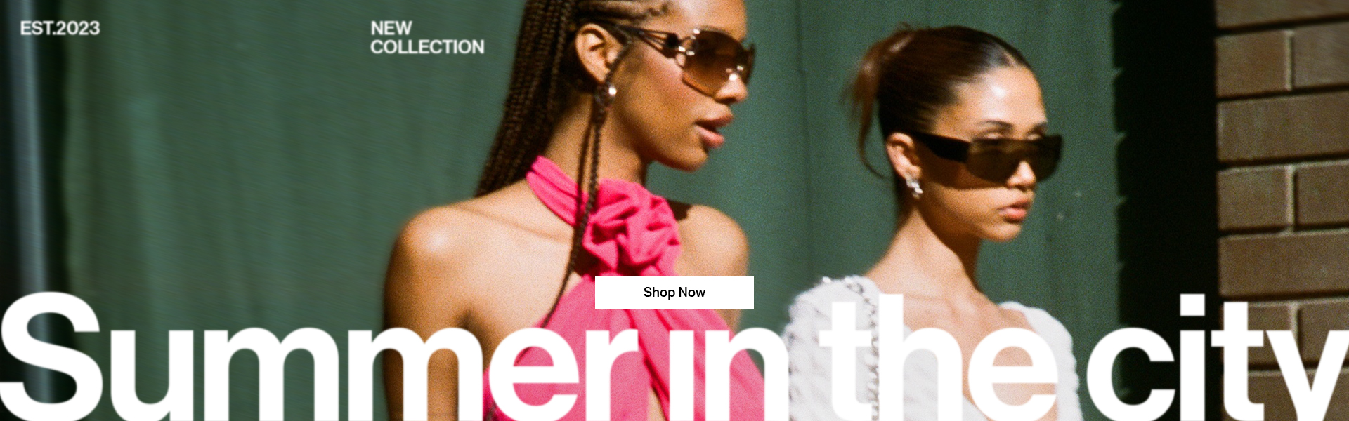
Summer In The City
A fast, punchy campaign inspired by city life, cult print magazines, and the haze of a hangover brunch, where ecommerce meets editorial.
Brand Graphics Lead - Art Direction, Graphic Design & Motion Graphics


The brief
Inspired by metropolitan wayfinding graphics, blurry city nights, and cult print magazines. This campaign was created to speak to the it girl audience. The type who might be hungover, pulling on sunglasses, and heading to brunch. The visual tone needed to feel fast, lived-in, and stylishly chaotic, capturing that in-between moment where real life meets editorial fantasy.
The original concept leaned into the idea of memory and imperfection. I explored scrapbook style layouts with ripped edges, tape textures, and layering to suggest the fleeting nature of summer moments. Blurred typography became a key device early on, representing disorientation, speed, or a half-remembered night and this carried through the development process.


The final creative leaned into wayfinding graphics, using bold directional typography and purposeful distortion. I elevated standard e-commerce and campaign shots by introducing heavily blurred versions of the models as background textures. Creating surreal, colored backdrops that connected visually with the garments. These overlays added motion, depth, and a unique fingerprint to each layout.
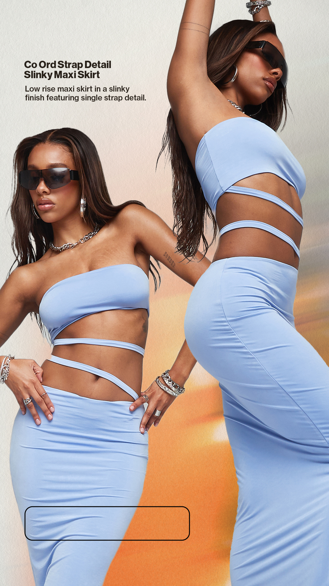
Key Image
The hero asset for the campaign was designed to be loud, direct, and disruptive, a visual pattern break in a feed full of neutral tones. I took inspiration from Gregg Araki’s Nowhere, using layout tropes and an acid green pulled from its poster. The reference was intentional, aimed at a style-literate audience likely to recognize and resonate with niche underground influences.

Styleframes
The campaign’s key visuals were developed as styleframes for wider rollout. These took cues from my collection of Dazed magazines, along with my personal archive of 90s rave flyers. The resulting visual language was layered, print-like, and texturally rich, setting the tone for a whole ecosystem of assets.


The social feed was treated like a magazine. Bold covers, editorial layouts, and a hybrid of campaign and ecommerce content. Scrapbook elements and motion blur gave the assets an analog meets digital quality, positioning even transactional imagery in a way that felt stylised and elevated.
Carousels
These were designed like magazine spreads, a mix of campaign and ecommerce photography arranged dynamically. Campaign images acted as visual breaks, like a full-page ad interrupting an article. In ecommerce slides, gradient maps and blurred imagery were used to unify styling and amplify color stories.


Stories
Instagram Stories combined the campaign’s arresting photography with offbeat typography. Type placement was deliberately loose and playful, and the compositions mimicked magazine editorials. Everything was high-energy, scroll-stopping, and cohesive with the main feed.


Email and site imagery was kept modular and dynamic. Some email assets were delivered as animated gifs to add movement and interactivity. The visual system carried through here, minimal but high-impact, built on a foundation of great photography, blur, and bold text placement.
E-commerce Banners
To create a visual bridge between ecommerce and campaign, we layered blurred model cutouts into the background of product imagery. This gave typically functional content a more artistic feel while remaining clear and shop focused.


Campaign Banners
Banners focused on bold, campaign led visuals. The use of directional typography and compositional energy was key to conveying the spirit of the creative. These assets were designed to feel like ads ripped from the pages of a fashion magazine.


Mobile & Email
Mobile and email assets were built with pace and playfulness in mind. Typographic animations and quick swap gifs kept user engagement high. On mobile, strong photography and tight text grids ensured assets popped in even the smallest screen contexts.


-WK01_20230427_New_In_Drop2.gif)

We used the brand's standardised motion system, developed by me, with blurred background colors and hero models moving dynamically across the frame. I created a custom LUT inspired by early digital cameras and point-and-shoots, adding film grain for a slightly dated, lo-fi charm, almost verging on cheesy, in a way that felt on-brand and self-aware.


Knightvision.Studio is the creative practice of Jack Knight, a Graphic Designer, 3D Artist and Art Director based in the North West, UK.

